So I’ve just switched to a new kind of theme that should allow me to organize the site a bit better. What does everyone think?
New Format!
So I’ve just switched to a new kind of theme that should allow me to organize the site a bit better. What does everyone think?
1–2 minutes

5 responses to “New Format!”
-
Hey John, I like the format alot. The only thing that is kinda strange is how the section with content is white with the black outline surrounding it in a C shape, with a shade of grey on the right side (perhaps it is not loading right on my machine?). I really like the organization, however, it is a big improvement. I especially like how the latest is easly found on the left hand side, which is great when I am checking the blog and wanting to see the newest posts.
-
Mmmm not seeing that on my screen. Would you mind sending me a screenshot? I can forward it on to tech support and see if they have a solution.
Otherwise glad you like the new format! Yeah I hated the way my old blog was set up, I just couldn’t organize it like I wanted. Fortunately WordPress has made some changes that made it easier since the last time I tried. Your review for Planescape will be coming up this week 😉
-
-
I’d like some #page { margin: 0 auto; } centering personally.
-
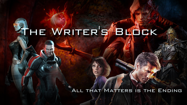
My favourite part has to be Shepherd gazing menacingly at users over the menu bar “My name is commander Shepherd and this is favourite site on the internet : STAY!”.
New format is pretty good. ^^
-
Awesome. That was originally going to be a place holder, it’s just a blown up version of my Patreon image. But I’m glad you like it! I may end up keeping it now, maybe just tweak it a bit in photoshop to eliminate some of the fuzziness from the zooming in.
-

Leave a comment